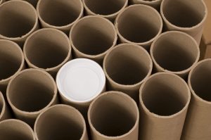
If you have a fair understanding of what’s going on with paper Cylinder Tubes design, this may be the early initiation you have been waiting for to start such an eco-friendly business-if you need more information pertaining to some of the minute details of production design. Take a quick look at our handy tip list below, before taking up any dielines; that may save some last-minute edits sometime later in the timeline.
Seam placement of patterns is pretty fiddly. Avoid using design elements into which seam wrapping tolerances may interfere to cause misalignment.
Smaller artwork is more easy to register. The closer to the edges, the greater the tolerance variations seem optically.
Plans can change. And sometimes, going from uncoated to coated paper-or any other material-on a project will make you need to change Pantone colors. You can anticipate that in advance with global colors.
There are gaps allowed where the top and bottom parts meet, so just go with it, and use a design which doesn’t depend on key parts lining up along these seams. Use the disks to describe what the “face” of the tube looks like.
Divide the circle in half for front and back alignment guides. * Move your artwork a little to avoid seam areas so that it is clearly visible in front.
Following are the dielines laid out in such a way that the lip artwork will match up with the base and cap artwork.
Competitive substrates should be avoided. One can always tell the difference between two competitive processes. Look at how special features play together-some options don’t work at all, and others fit just perfectly. Further, here is a list of what goes well with “Specialty Stacking”. Combined effects are possible: Emboss/Deboss and Foil; Spot UV and Printing. Combined effects are not possible: Spot UV + Emboss/Deboss; Spot UV + Foil.